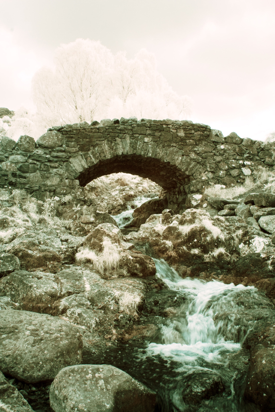
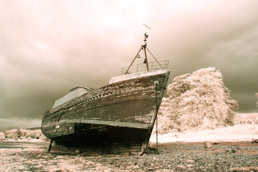
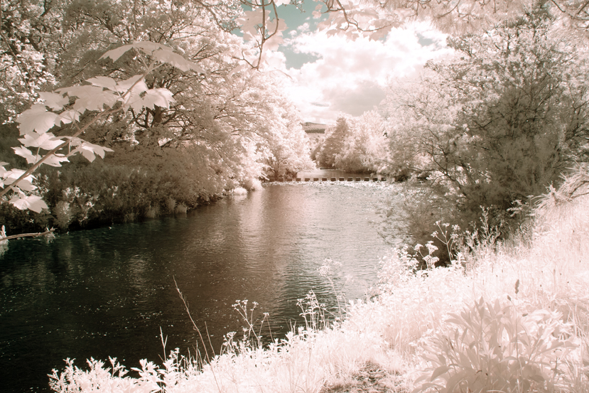
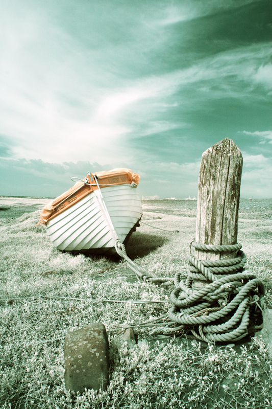
I said in my last post that I would post some of my infrared photographs that I have processed as colour. Here is a selection, firstly from the camera that had been converted with a 720 nm filter over the sensor, then from the full-spectrum camera with a selection of filters fittted to the front of the lens.
Canon 350D – Converted Camera:-
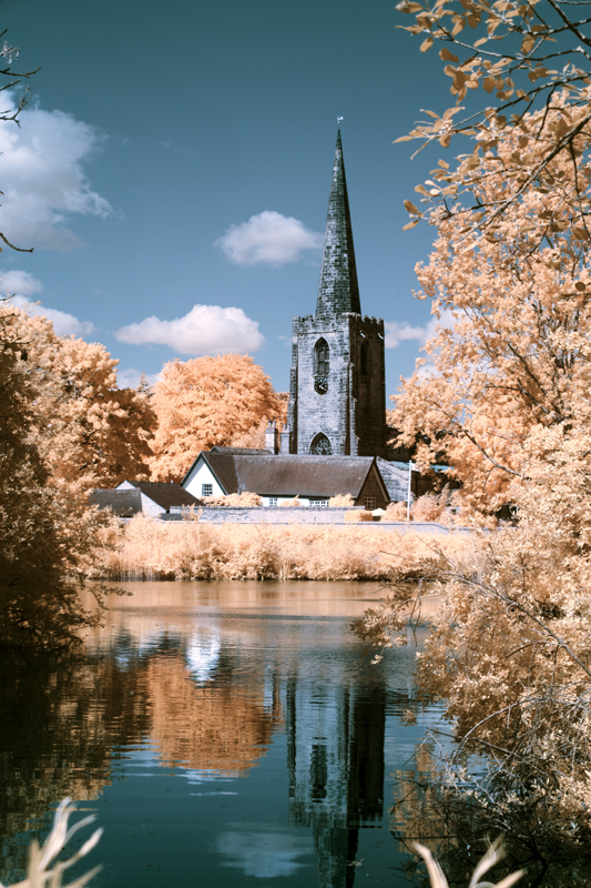
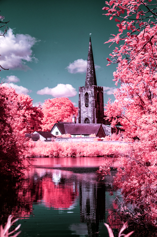
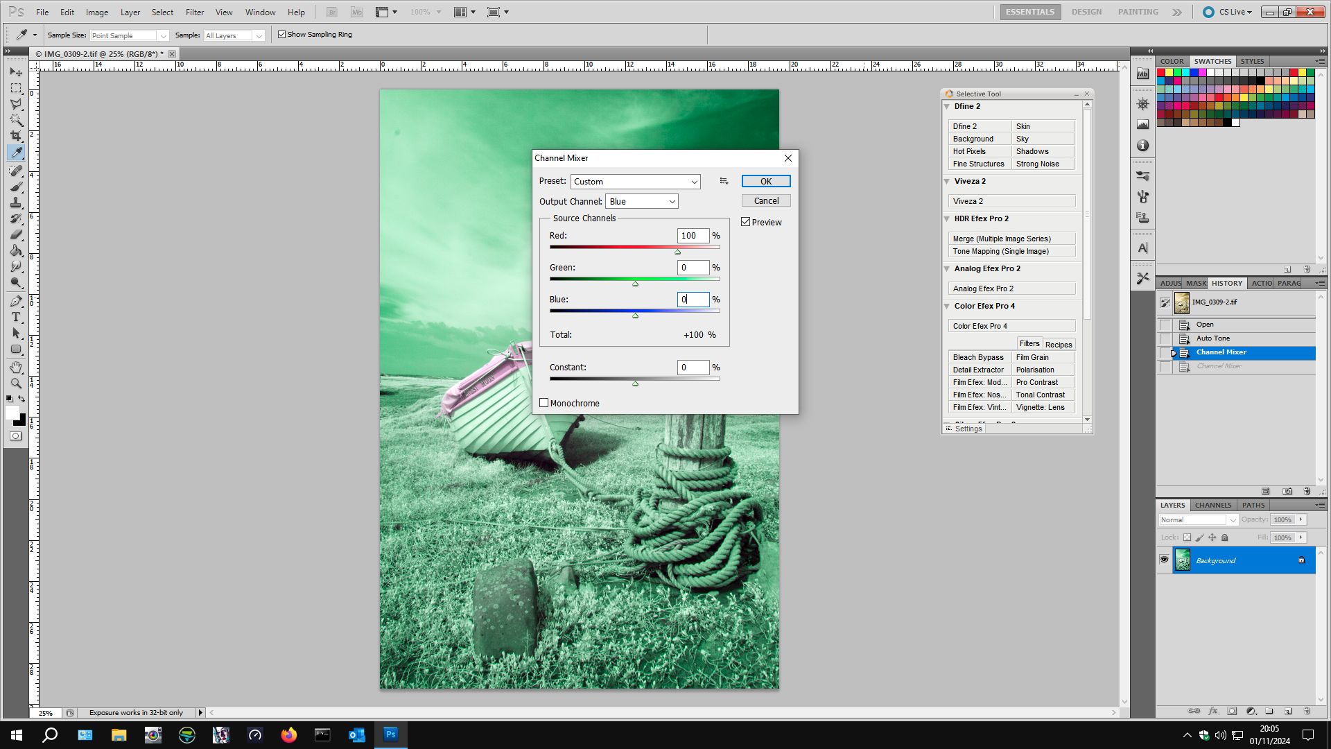
The above two images are the same original image. The first one was processed using channel mixing and layers and the second one shows what happens when you then adjust the hue – in this case plus 163.
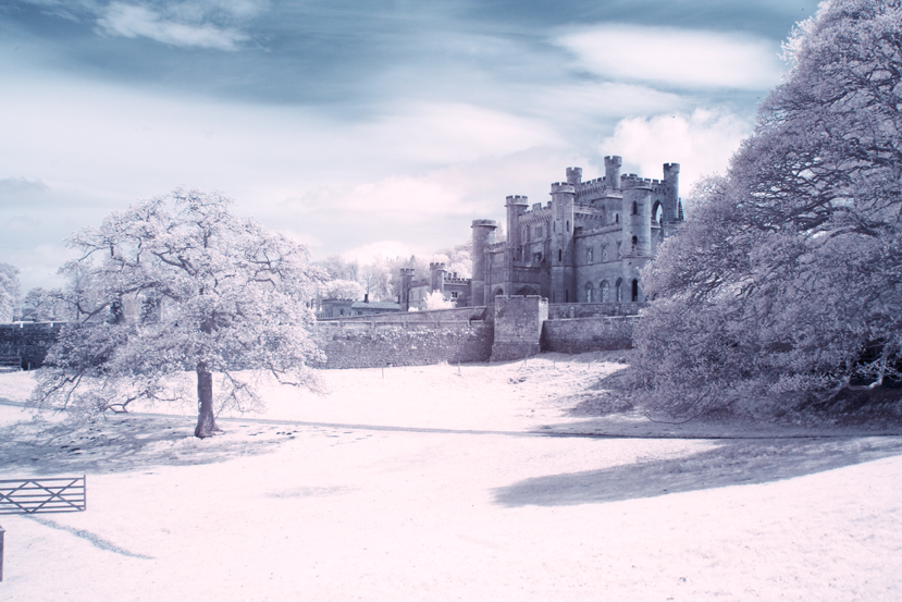
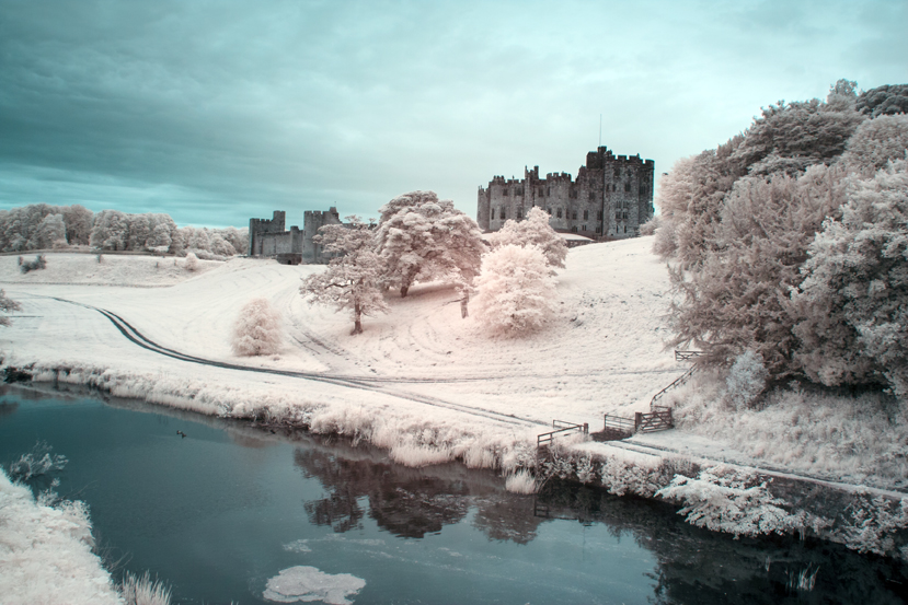
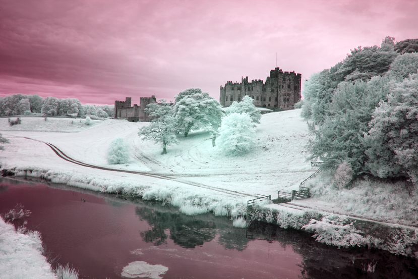
I have done the same with the next two images of Alnwick castle – first the one without hue adjustment and the second one with a positive adjustment of about the same magnitude, although, a small negative or positive adjustment can make quite a difference and I would urge you to experiment.
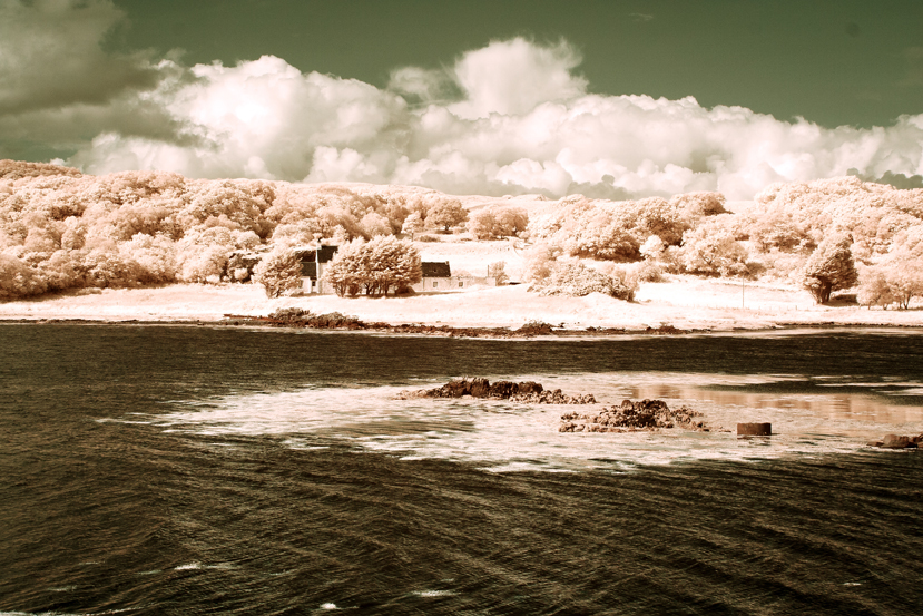
Full Spectrum Camera with Variable Filter.
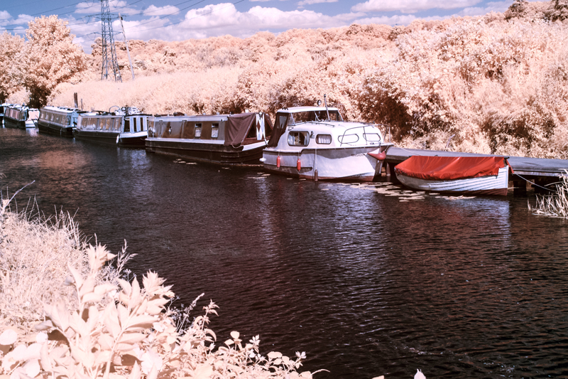
530 nm:-
Hue minus 50No Hue Adjustment.Hue minus 50No Hue AdjustmentHue +/- 180
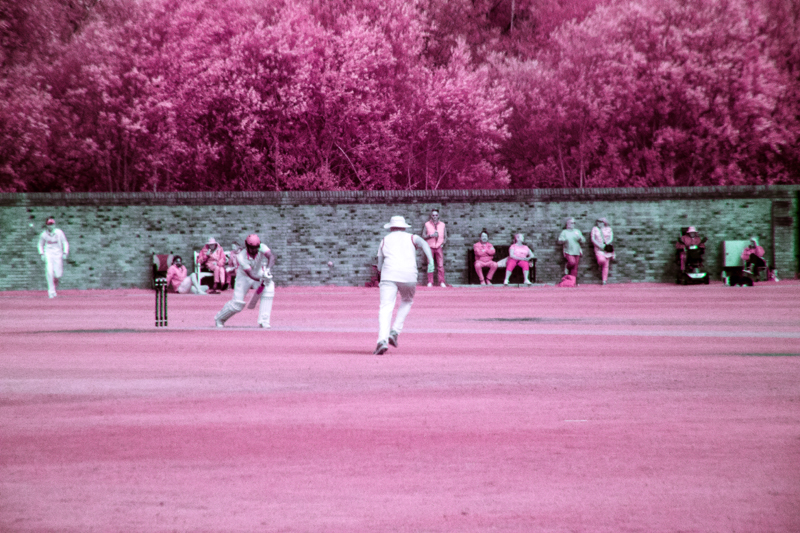
Filter set to 640 nm (approx):-
No Hue AdjustmentNo Hue AdjustmentHue minus 28
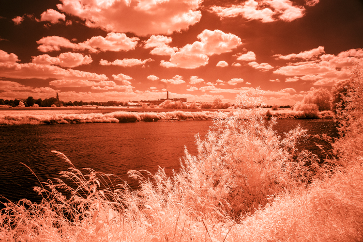
You will notice that there is more of a red tone predominately in the originals – turning the trees orange instead of yellow as with the 530 nm filtration.
750 nm:-
No hue adjustmentConverted to Black and White
With the 750 nm filter there was not much scope for hue adjustment because very little visible light was getting in, mostly infrared. I could have added a bit more contrast to the monochrome image but there was little hope of getting much of value with the channel mixed version.
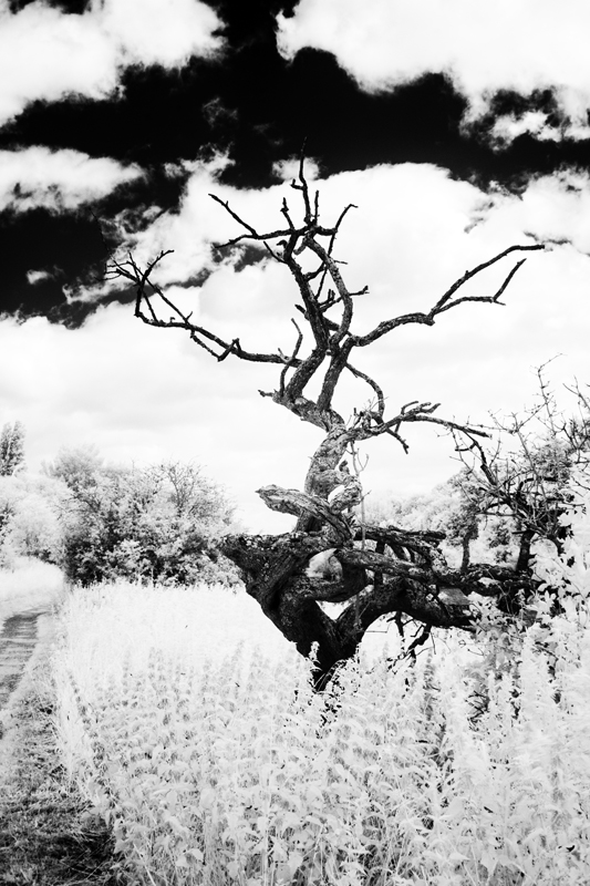
850 nm Filter:-
Channel MixedConverted to Black & White
As with the 750 nm filter there was no scope for bright and colourful images but with the mono conversion, I got a beautifully contrasty image.
It occurs to me that to get coloured “infrared images” we have to let a bit of visible light in too and experiment with the image using a myriad of adjustments using channel mixing, layers, curves to mention a few, to suit your individual taste. So far, I have only given you the basic version of channel mixing. Some mixes involve adjusting the green slider, having different mixtures of the red and blue channels or a combination of all these. Even then you are just scratching the surface. I mentioned Rob Shea a few posts ago, he provides a whole range of Camera Profiles for different cameras. He also provides a wide selection of Photoshop Actions which can be imported into Photoshop – instead of making the adjustments of Channel Mixing, Layers and other adjustments, you click on an “Action” and the effect of several adjustments are applied in one click. Follow these links for more:-
There are full instructions on his site on how to install these resources andyou can have them and much more for the price of giving him your email address. I have them and in terms of the Photoshop Actions, a good way of finding out about the many adjustments that you can try out and provide a quick way of finding out which adjustments and effect you like.
I must say at this juncture that I have no connection to Rob Shea except I follow him on Instagram.
That is all for today folks. I hope that you will be back soon.
In my post, I wrote about how I fell in love with infrared photography and how for years I converted my images to very stark, contrasty black and white images. I was very pleased with them but recently, I started to see more and more infrared images that were in wonderful and strange colours. I decided to find out how these images were produced. Todays post is about some of the ways that can be achieved. One thing that I found was that there is plenty of room for experimentation and the way that I am going to demonstrate is only a starting point.
The methods that I describe involve working on RAW files in Lightroom or Camera Raw in Photoshop. You could use .jpgs from your camaera but you will have very limited control over the end product. To do what we are going to do, use the RAW files.
First you have to create a camera profile which you will need to get the best effects. Lightroom and Photoshop use Adobe Standard which gives very different results for the file that you will work on in image editing.
You will only have to create a Camera Profile once. After it has been created it will appear automatically in both Adobe Camera Raw and Lightroom if you have it.
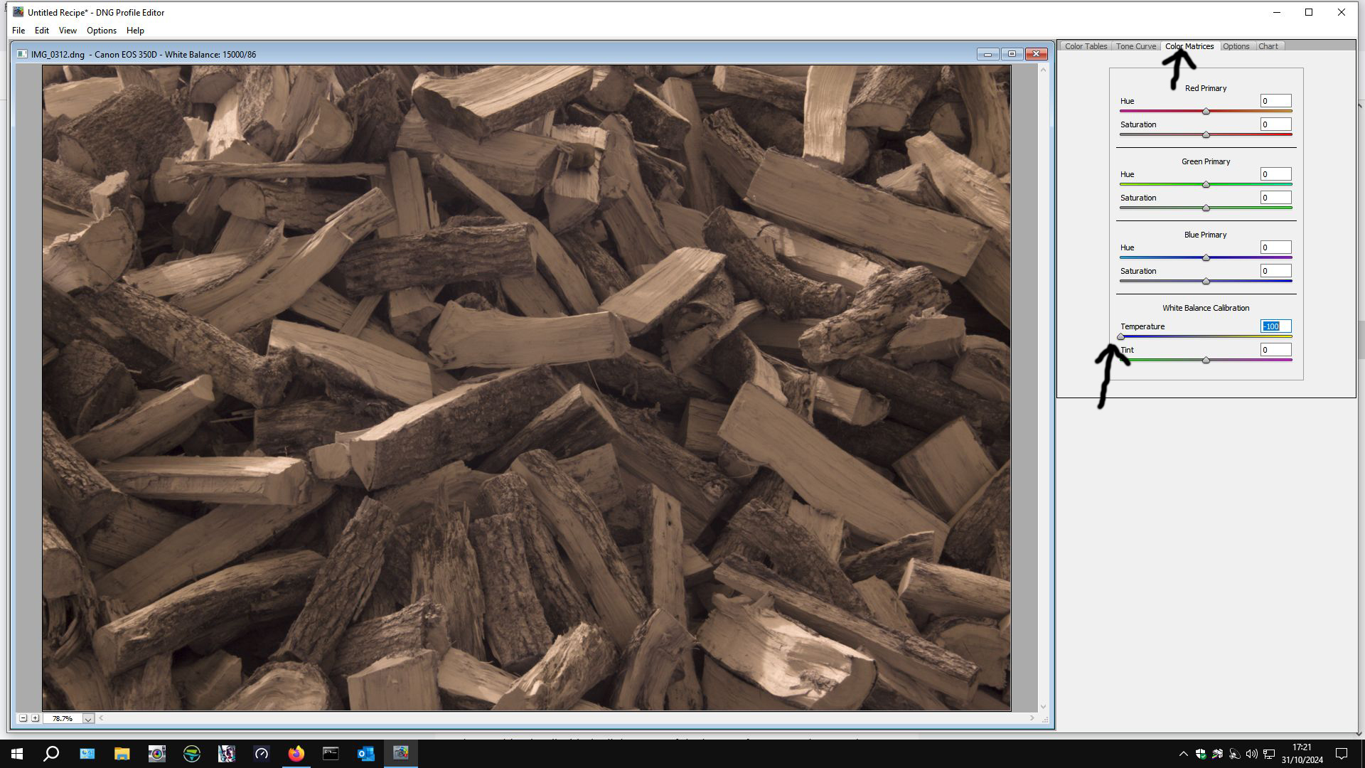
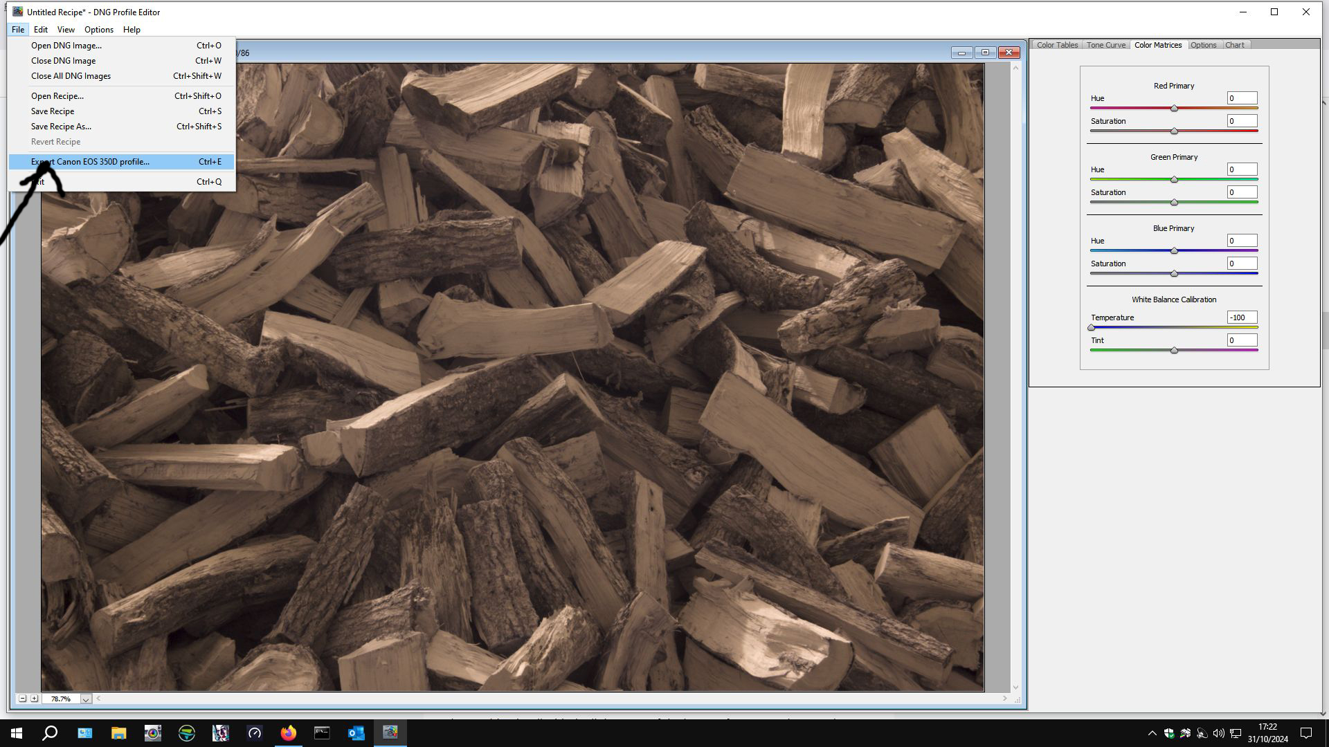
Here is how to create your Camera Profile in Camera RAW in Photoshop:-
First, open your RAW file in Photoshop. This will automatically open up Camera Raw.
Save the file as a .dng file in a convenient place.
Next open up DNG Profile Editor. If you don’t have DNG Profile Editor you can download it from here:-
Or search online for Adobe Digital Negative – it is a free utility.
When you open DNG Profile Editor open your .dng file from where you saved it.
When it opens up, go to the color matrix tab on the right-hand side.
Then slide the temperature slider over to the left. Some people say to -90, others -100. I set mine at -100. Then export the profile – DNG Profile Editor will have read which camera you have used and this will form part of the profile name.
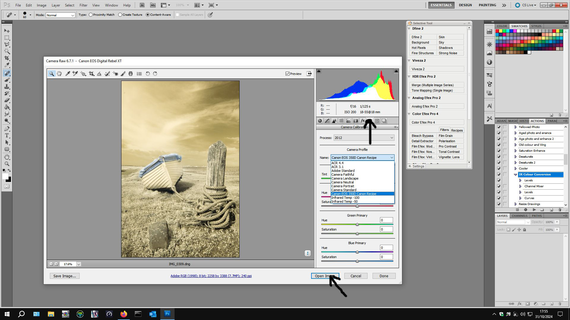
Navigate to C:\Users\<<your username>>\AppData\Roaming\Adobe\CameraRaw\CameraProfiles\ and save your camera profile in there. It comes up with a title for your profile but the middle part says “untitled”. You can customise the title – it allows for multiple profiles for the same camera to be created.
A word of caution \AppData\ is a hidden file so you may have to “show hidden files” within your file options in Control Panel. If you don’t know how to do that, there are many good online resources that will help you to do that.
If you have used Photoshop and Adobe Camera Raw, open your .dng file in Photoshop again. Camera Raw will open up again, this time go to Camera Profiles in Camera Raw (arrowed):-
From the drop-down list click on the camera profile that you have created then click Open Image (second arrow) and your image will open in Photoshop.
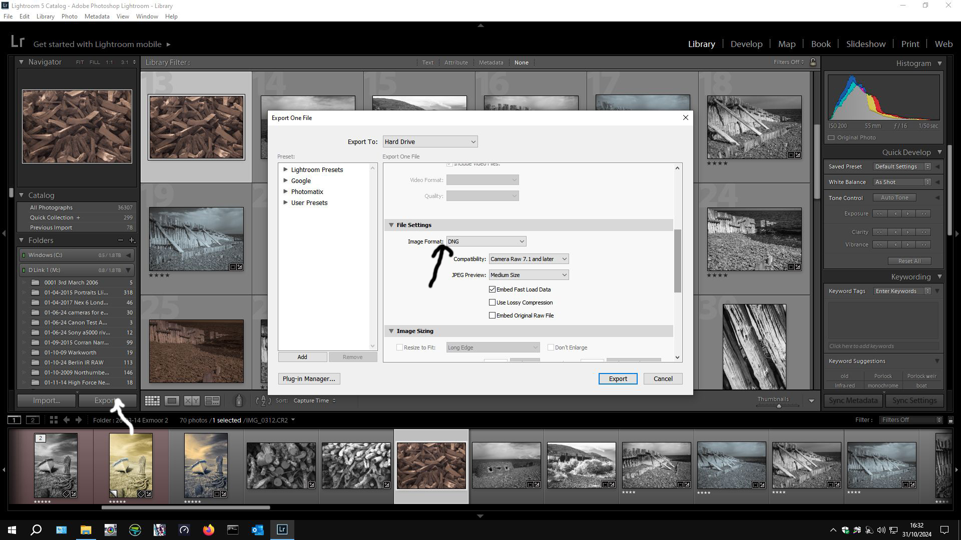
Instructions for creating a Camera Profile if you use Lightroom.
Import your RAW files into Lightroom as usual. Choose one file and export it as a .dng file and remember where you saved it to.
Then open DNG Profile Editor as before and create your Camera Profile. Restart Lightroom and then edit the rest of your .RAW files using this camera profile instead of Adobe Standard.
Camera Profile is found at the bottom left hand side (arrowed). Make whatever adjustments that you want to make – I usually click “auto” because any other adjustments can be made in Photoshop. I sometimes tweek “clarity”. If part of the image is “blown out” I adjust white levels. It is a very individual thing – this is my way, there is no one way – experiment. Then I export the file using what ever format you like. I usually export as .TIFF files at 300 dpi for best quality but if you have Lightroom, you will know how you like to export your files.
Whatever way you have created your Camera Profile, open them in Photoshop to work on them. If you have gone the Photoshop – ACR route, open your RAW file in photoshop and ACR will open, apply the Camera Profile then Open Image. The image will open in Photoshop ready to be worked on. If you went the Lightroom route, open your saved file in Photoshop ready to be worked on.
Drum Roll…..
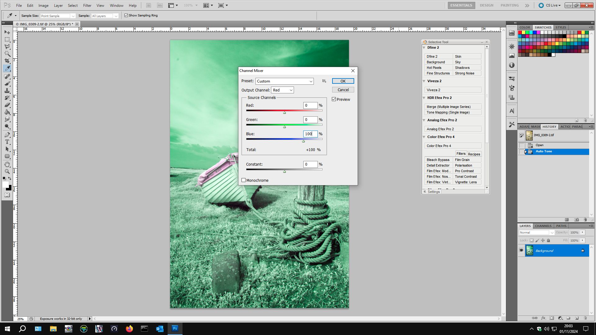
Once in Photoshop (or any other Photo editing suite capable of Channel Mixing):-
Image > Adjustments > Channel Mixer.
Select Red from the drop-down list. Slide the Red slider to 0 from 100 and the Blue slider to 100 from 0.
Select Blue from the drop-down list and move the Red slider to 100 from 0 and the Blue slider to 0 from 100. The image will turn funny colours. Click OK.
Next, open image > adjustments > levels.
Select Red from the drop-down list (Default RGB) and move the right slider to 220 from 256. Select the Blue Channel and move the middle slider to 0.70 from 1.00. Click ok.
Below is my file from Lightroom (This is how it looks when you open it from ACR too after Camera Profile has been applied).
The file that you start to work on in your image editing software will look something like this. You could convert it to black and white but we are going to give it some colour to produce something like:-
This is how this file turned out after I applied the Channel mixing and Layers adjustments described above were applied.
In addition to these basic adjustments, I also like to apply an Auto Tone before Channel Mixing and Layers adjustment to give it a bit more punch. After applying Channel Mixing and Layers, you might like to apply Curves to improve contrast (or reduce it). You could apply other basic adjustments “to taste”. One way to change the colours dramatically with “artistic effect” is to alter the Hue (image > adjustments > Hue/Saturation) – have a play by experimenting with positive and/or negative values for hue to get different effects. You might want to apply a saturation and/or brightness adjustment but I find that I get better results with Brightness/Contrast Curves, or Vibrance.
There are many ways to create coloured infrared images. This is just to get you started and it is my way, this is how I started. Internet searches will yield many ways, based more or less on this basic editing technique, to create fantastic coloured infrared images so my advice is start doing what is described here and then start to experiment with your images, search the internet for people who excel at this. A couple of names to search for:-
Rob Shea
Matthew Stuart Piper
Both have websites with lots of examples of excellent work.
Next Post, I will give more examples of my infrared images of which I have created coloured versions
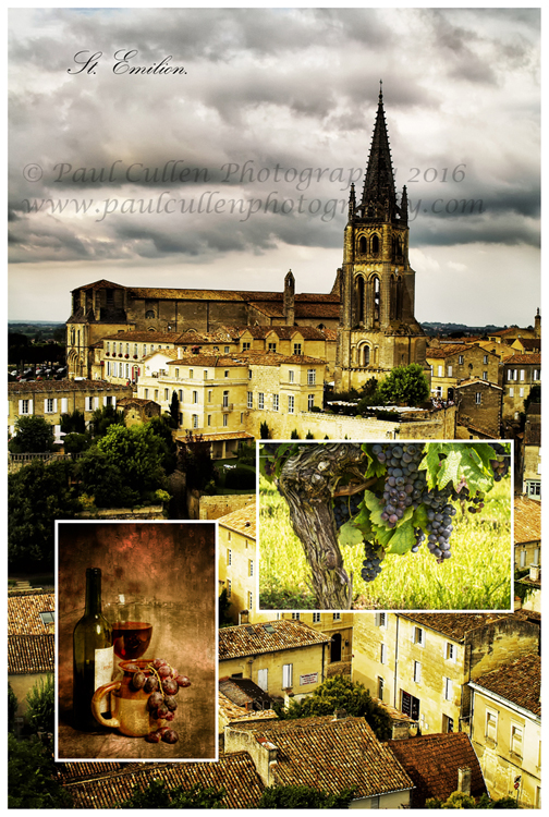
The camera club that I belong to Beeston Camera Club is always on the lookout for new and interesting ways in which to engage the members in activities as well as turn up for the great variety of interesting and varied speakers which have been hand-picked from fine photographers from near and far. One such activity was to create a photo project which was to be constructed from three separate photographs. We were sent some examples but the brief was very open (and essentially open to interpretation). The resulting works were presented to the members at a “members evening” last Thursday, the 11th February 2016. Several members produced works for the event. The result was wonderfully diverse in terms of interpretation. I contributed five works and had great fun doing them – here they are:-
This was my first attempt. It is made up of the same image but in the three instances the image was given a different treatment in Photoshop with Nik Color Efex pro 4 and Nik Silver Efex pro 2 plugins.
Next, I decided to use some square images that I had produced. This time it is three separate images/compositions and they were given different treatments in Photoshop and Nik Plugins. It started as just the three squares but it looked a bit long and thin so I extended the canvas above and below and coloured the extensions black. I think that it looks quite effective, but then I don’t let ’em out until I am happy with them! I was only going to enter one and this was my choice, but was encouraged to send more, so I sent my first work together with three further works after contributing this one.
Saint Emilion, one of the great Bordeaux wine regions and a beautiful place to visit. Saint Emilion is found to the North-east side of the City of Bordeaux, Aquitaine, France.
I thought of a wine theme with this one. The larger background image is of Saint Emilion, the very famous wine region – part of the Larger Bordeaux region in Aquitaine, France. I have been there several times now and it is always a pleasure. It is a beautiful village, even if you are not interested in wine you will enjoy a visit. The grapes on the vine was actually taken outside of Bordeaux (not far) in a village called Villeneurve de Duras in the Cotes de Duras wine area, not far from Bergerac – it is one of my best sellers on Shutterstock and has sold all over the world. (I did take some photographs in the centre of St. Emilion and some of those have sold too). The third photograph was a still life photograph that I made and then put it through Smart Photo software from Anthropics to give it an older look.
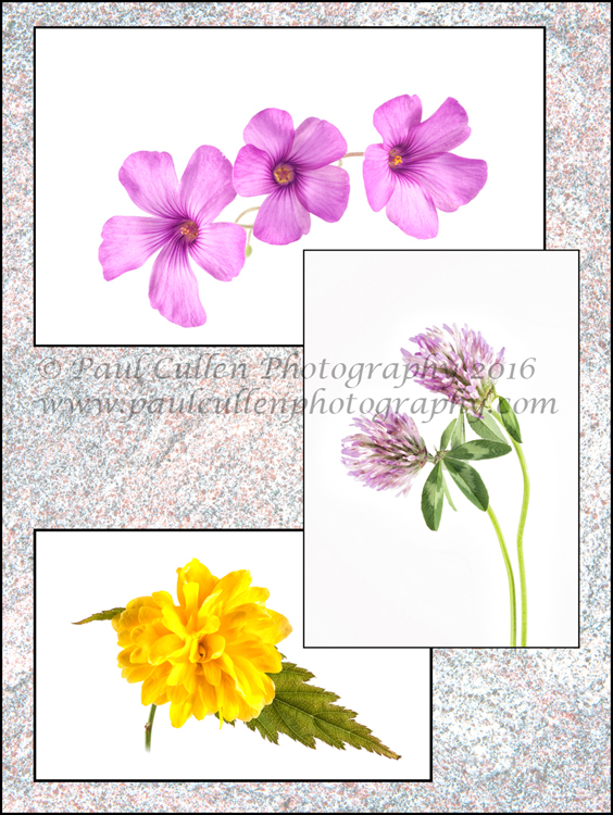
A mixture of Oxalis, Kerria and Clover on a textured background.
A while ago I went out and picked some flowers – the Oxalis and the Keria grow in my garden – the clover from the Local nature reserve and I photographed them on a white high-key background in a light tent. The textured background was the back of a red granite grave stone. I changed the blending properties on that layer and altered the opacity (and probably the brightness). The flowers were placed onto the background by copy and pasting them.
Turbulence in Water – Abstract
Finally, the theme for this one was waterfalls. The background image was an abstract of flowing water from Aira force, approachable from the north side of Ullswater, Cumbria. Aira Force is a National Trust managed series of lots of waterfalls. The image in portrait format with the bridge is the first substantial waterfall that you come across as you ascend Aira Force – I would have been happy with just this one, but there are more falls – lots more culminating in a huge wide torrent at the top. The other photograph was taken at Watersmeet near Lynton and Lynmouth, Devon and is within the Exmoor National park.
I am sure that I haven’t done my last three in one composition; I enjoyed myself so much with this photography project that I am keen to explore more possibilities – why don’t you give it a try?
I have lot of photographs in storage and occasionally I will look at them and I get inspiration to do something different with them in an effort to expand my Photoshop skills. The following photographs were created on such an occasion. This is my friend Emma. She invited me to take photographs of her and her lovely family over a year ago. Recently, I revisited those photographs and these are some of the results:-
I changed the colour balance and added some diffuse glow.
All comments welcome; I am trying to create photographs that people will like and I am pleased with these, but I would really like to know if I was barking up the wrong tree.
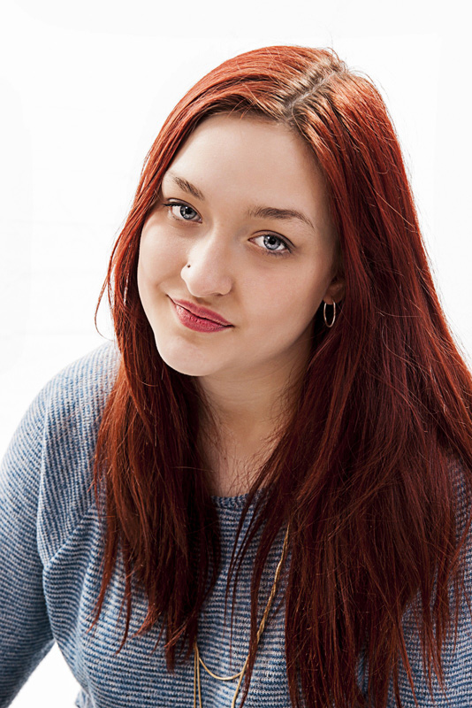
This is Stacey. The photography was made at what is now known as First Point Photography – a photographic studio which also provides Portrait & Wedding Photography courses in Bournmouth, U.K. I was on the course when this was taken back in March 2010. Check them out, they usually advertise in the Photography Mags.
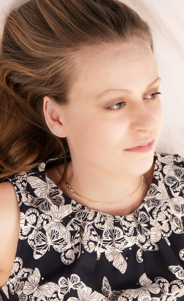
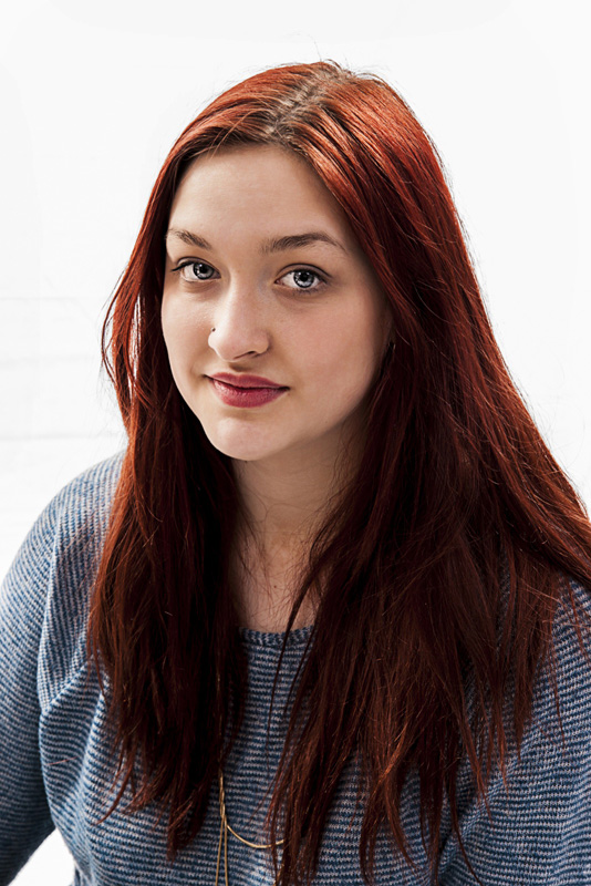
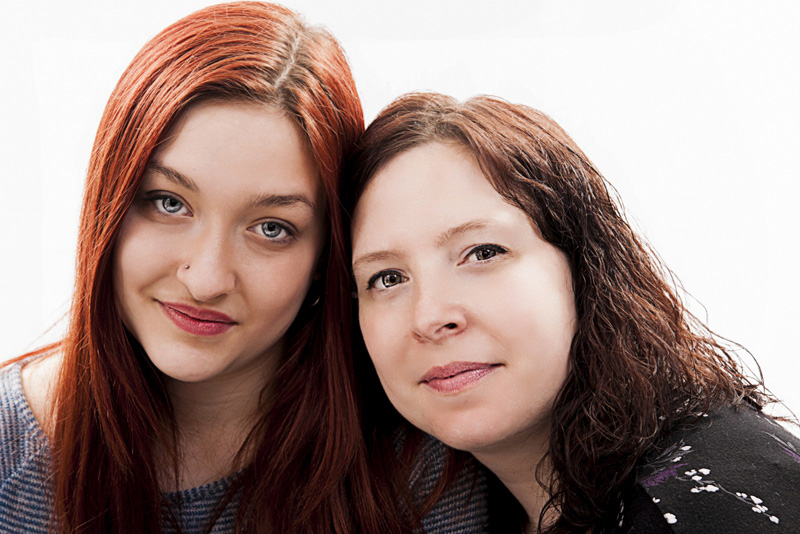
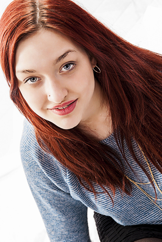
I had the opportunity to photograph my friend and her lovely family. Part of the brief was to get some nice photographs of my friends daughter Nicole who was going to University to study a Drama based degree, the details of which escape me at the moment. Recently, I had the opportunity to look at these photographs again and have a “Play” with them in Portrait Professional and Photoshop. Portrait Professional is software for retouching portraits – removing wrinkles, dealing with skin blemishes and so on. You would guess right if you thought that Nicole wouldn’t need any of that, but I have used it to “Brighten” her eyes and a few other small adjustments for artistic effect. PhotoShop was only used for sharpening – all digital photos put through a RAW converter need sharpening – cameras that convert straight to Jpeg do the sharpening “in camera”. I also used PhotoShop for resizing to web size.
I usually use a filter called “High pass” then levels for sharpening, using “Unsharp mask” only if the first stage doesn’t work sufficiently, which is rare. You have a choice of light including “soft light” – my favourite for this sort of assignment, “Hard light”, “Vivid light” and a few others – the above photograph has had the benefit of “Vivid light” however, I had already made it quite contrasty in Portrait Professional. I wanted “Striking”.
I used to love slide film – I really got into the differences in colour properties between Fuji Velvia @ iso 50 and Astia with it’s more neutral colours (Velvia gave warm sumptuous colours. Now I am all Digital – if I want those differences, I have to play around in Photoshop) – and what of all my slides?
Early on I bought myself a film scanner (or two) – a flatbed scanner with a backlight for big slides and I later bought a dedicated film scanner. Now, many years after I “went digital” I am still scanning slides when I get the time. Here are a few of them:-